Brief 1 – Appropriation (Final)

Appropriation as a satire 

The concept for the appropriation brief was to reveal the undercover reality of advertised products. In this particular case, the products that can be considered as a drug but are not taken as one by society. This products are portrayed as harmless but have a detrimental effect when consumed. Being basically used as an everyday stimulant.

To capture this, a collage of elements, within the magazine advertisements, that point out the ugly truth of the product.

Cocaine-Cola

Original image:

Stay-Inside-The-Lines


Appropriation image:

CocaineAd

The ‘Cocaine-Cola’ has a strong reference to the curious fact that until 1903, the world-famous soft drink contained a significant dose of cocaine. Some research suggests that even up until 1929 there were still traces of cocaine in the drink.

Even without cocaine in it, has in this century, Coca-Cola is still a controversial drink. It’s common knowledge that the drink is detrimental to one’s health. Even though the caffeine in Coca‑Cola products is not addictive, the sugar rush effect experienced while drinking it, resembles the process of being ‘high’ while consuming drugs. Besides that, Coca-Cola is one of the most popular drinks in the world, being worldwide consumed and it is common for even children to drink it.

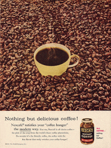
Prescription Coffee

Original image:

Instant-coffee

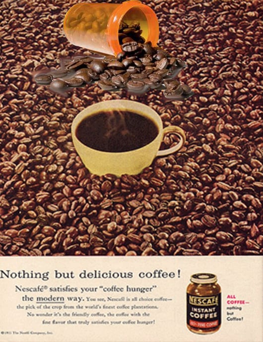
Appropriation image:

CoffeeAd


The ‘Prescription Coffee’

We live in a culture where the consumption of coffee is downplayed as something casual, perfectly normal. Many people have this undercover addiction with coffee. Going almost crazy if they don’t have their cup of coffee in the morning and sometime throughout the day. So, there is this idea that coffee works like a prescription pill, something that you need to have in order to function. But it’s often taken as a harmless drink. Even romanticized.

Brief 2 – Things (Final)

“What do artists have in their pockets?”

This brief aims for the usage of found or borrowed objects. These objects need to be given a new lease of life and context. A meaning that surpasses the one in which they were found. Taken this requirement, the chosen concept relates with iconic objects in the world of the arts. Simple objects that are key elements of a certain painter. Inspired by a few painters, one can come upon this idea of having the wondering question of what some of them may have in their pocket, in relation to their very work. So, after that, it was time to borrow the objects and then transform a scenario. Each ‘set’ goes after the imaginary world of that specific painter, making the found objects come together as this iconic assemble.

Andy’s Pocket

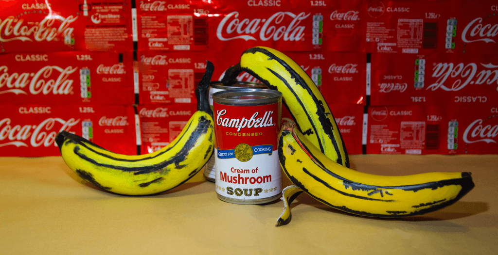
Andy Warhol was the first artist that came to mind, that may be because of his use of simple materialistic objects from popular culture. Andy is known for using a variety of images from the world of commerce and mass media. We live in this cluttered world where most of the found objects on the ground have perhaps 95% of the times a brand in it.


       bananacampbells

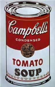
“I knew Andy very well. The reason he painted soup cans is that he liked soup.” In the world of Still Life is amusing when the artist merely paints the things close to their heart and can make them as big as a stamp in the world of pop art. Enjoying eating Campbell’s soup, having a taste for Coca-Cola. Is fair when the objects on someone’s work reflect their environment. Something that belongs to the mundane, commercial world can became the subject of a work of art. Being a consumer of such products, Andy found inspiration seeing the empty cans and bottle accumulate on his desk.

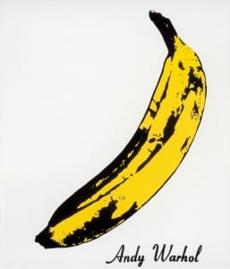
Beside the Campbell Soup, the iconic print of a banana featured on the cover of the debut album of the band, titled The Velvet Underground & Nico turns to be one absolute identifier for Andy Warhol ‘collection of subjects’. Warhol’s Banana became one of the most recognizable pieces of pop artwork.

So, those were the two subjects that reflected Andy’s universe the most and also were objects that were easily borrowed.

This is the final photograph:

AndyW

Van Gogh’s Pocket

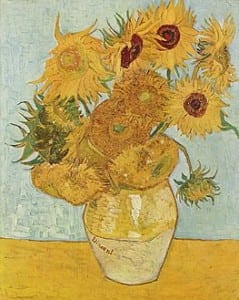
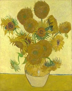
Thinking what might be on Van Gogh’s pockets, what comes to mind is straight away “nothing but sunflowers”. The sunflowers are the subject of two series of still life paintings by Vincent van Gogh.

‘Vase with Twelve Sunflowers’ and ‘Vase with Fifteen Sunflowers’ are considered a defying point in Gogh’s painting style. Van Gogh ‘discovers’ the sense of color and light. Twelve Sunflowers in a Vase can be considered the culmination of all this effect in his work. The sunflowers progress in all stages of life. This work was considered innovative for their use of the yellow spectrum, partly because newly invented pigments made new colours possible.

This painting has become somewhat the symbol of Van Gogh’s work, being the painting that is most often reproduced on cards, posters and mugs. It was also the picture that Van Gogh was most proud of.

 
Vincent_Willem_van_Gogh_128Vincent_Willem_van_Gogh_127

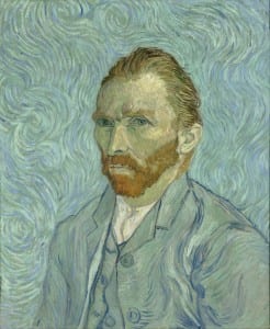
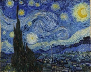
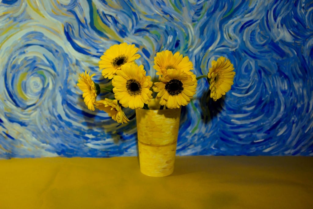
For the scenario: the background revolves around a certain theme that relates to the way Van Gogh painted the sky and the ‘contextual’ of his paintings. This helps bring the sunflowers more to life and makes the connection between the object and the painter’s identity quite obvious.

Vincent_van_Gogh_-_Self-Portrait_-_Google_Art_Project1280px-Van_Gogh_-_Starry_Night_-_Google_Art_Project

This is the final photograph:

VanGogh

Magritte’s Pocket

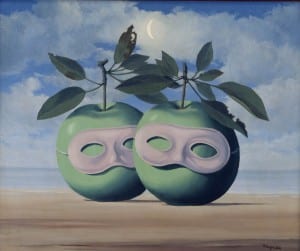
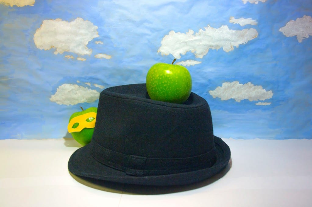
Surrealist painters also have their set of realist objects even if they take a creative twist. A green apple. An apple from the dreams or perhaps the nightmares of the Belgian Surrealist painter René Magritte. Apples appeared in many of Magritte’s works. The image of the apple is one of the most frequently recurring: apples wearing carnival masks or a single very large apple floating above the head of a man.

716edda194eda9bf6204d58dd59ea2ca

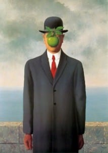
The Bowler hat is also a recurring feature, this distinctive chapeau can be found in many of Magritte’s paitings. Like for example ‘The Son of Man’.

Ren? Magritte, The Son of Man, 1964, Restored by Shimon D. Yanowitz, 2009  øðä îàâøéè, áðå ùì àãí, 1964, øñèåøöéä ò"é ùîòåï éðåáéõ, 2009

A man in an overcoat and a bowler hat standing in front of a low wall, beyond which is the sea and a cloudy sky. The man’s face is largely obscured by a hovering green apple.

About the painting, Magritte said:”At least it hides the face partly. Well, so you have the apparent face, the apple, hiding the visible but hidden, the face of the person. It’s something that happens constantly. Everything we see hides another thing, we always want to see what is hidden by what we see. There is an interest in that which is hidden and which the visible does not show us. This interest can take the form of a quite intense feeling, a sort of conflict, one might say, between the visible that is hidden and the visible that is present.”

To represent that, in the final photograph, the masked apple hides slightly behind the bowler hat.

For the background, just like Van Gogh, the way to represent Magritte’s universe comes upon the way he paints the sky. Magritte’s scenario is often touched by these beautiful, smooth clouds over a clear blue sky.

5f4d7824b135c8af8c52bac5281bd7df


This is the final photograph:

Magritte

Final Triptych

Trip3

Brief 3 – The Portrait (Final)

One Self Portrait

Playing with mirrors, always has been a way to explore our self-identity. With or without a camera to capture the moment, that is still a form of diagnose. Our reflection. Besides the idea of expressing our self-identity through a photograph of one’s reflection in the mirror, there is also this intrigue notion of isolate spaces. Must of our Self Portraits happens in a bathroom or a private space, like our rooms. So, there is this idea of a space of solitude as a need to explore one’s self.

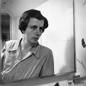
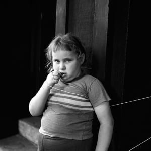
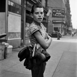
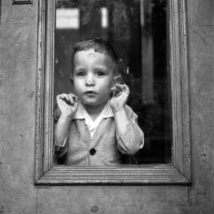
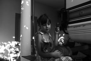
One of the photographers that played with this concept was Vivian Maier.

VM1956W03008-11-MC vivianmaier_selfportraits6 VM1955W06571-12-MC

“In their rigor, dark wit, and visual intensity, Maier’s self-portraits are the most intriguing part of her work.” – Terry Castle 

In Maier’s there is the motif of a mirror. Not only that, but the capturing of the self, leaves us wondering even more. A sense of loneliness, invisibility. Being there without being truly present. A mere display of a reflection. That doesn’t seem to reveal. A sense of staying impenetrable.

Self Portrait

SelfP

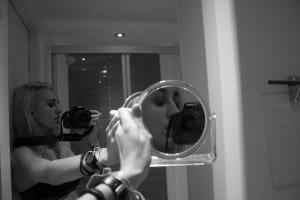
To discover this self-identity, playing with mirrors and reflections was the starting point. With this approach, you can manipulate what you want to be portrayed. Showing different angles and diverse parts of the countenance. Seeing more than just one viewpoint, through two mirrors, we have this echo effect. Something else is revealed, when is repeated with a new perspective by using a smaller mirror to show a different side of what we already seen in the big mirror.

Like in some of Vivian Maier self-portraits, the camera is present. That gives the audience this understatement, that you as a photographer wanted to register yourself in the first place, and as a photographer to do that so, you need to take your own picture. The camera is there because is what displays this concept of portraying the self.

Development of the project:

selftselft3selftry5SelfP2Selfselftry6
(I tried to experiment with the different angles as much as possible. I felt that I needed to reveal my face in its entirety, so that is why I was not completely happy with these).

selforiginalSelfP
(Original version next to the edited one).

The Familiar

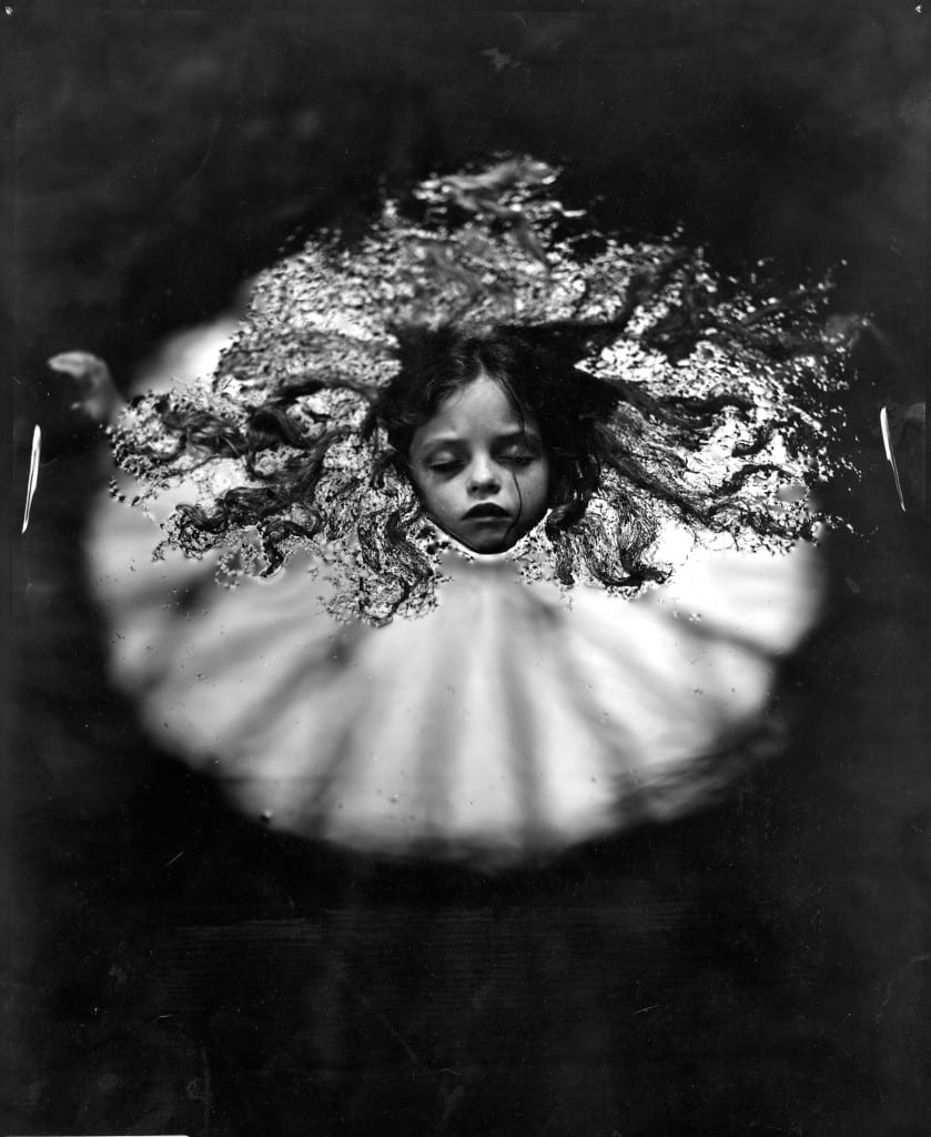
The idea of photographing someone that is completely comfortable with the photographer gives a change to explore different ways of creating portraits. In this attempt of capturing someone that we truly know, a certain energy is felt and makes the shooting a very relaxing experience. The feel of authenticity and truth is present. The complicity between subject and photographer is close-fitting. It works within portraiture. You are allowed to infiltrate someone’s soul. To represent this idea of closeness and relaxation, the concept of doing a portrait in the water emerged.

Two different photographs from different artists inspired this notion of tranquillity by being in the water.

Robert Mapplethorpe – Javier (1985)

bc3ca4b2


Sally Mann – At Warm Springs (1991)

cc3c1c03b7fe46125870c92e470be0b3

Portrait of Family Member

Sis3

Photographing someone very close to you is like being in the womb. A cocoon. The water gives that feeling of being in touch with one’s sensibility and space.

Development of the project:

IMG_9833  IMG_9839 IMG_9846 IMG_9848  IMG_9853 IMG_9854
(The original photographs came out a bit too dark, so after picking the one that I felt that portrayed better the feeling of being at ease, I had to light it up).

IMG_9849Sis3

 The Stranger

When you need to work with the unfamiliar, it’s still important to maintain the felling of genuineness. Upon that thought it occurred that it would be good to photograph a child. It’s possible to preserve more of the comfort and the result could probably be less stiff.

While looking through Vivian Maier’s body of work we can see some amazing portraits of children, maybe being a nanny helped that task to be materialized.

Even though she is mostly recognised for her incredible street photography, she has a wide collection of portraits. We can tell that the subject was aware of being photographed, the only thing that we are not sure is if a dialogue between them was involved.

FINDING-VIVIAN-MAIER-still-187122d94060feb79c1602c70f19dc4841vivian-maier

vivmai4 street-photos-new-york-1950s-vivian-mayer-4

Portrait of a Stranger

Stg

When photographing a child, you feel the honesty and frankness of the subject. They will not hide and they will be true. To immerse completely into the lives of others, a child will most likely give you their permission.

Development of the project:

IMG_8638 IMG_8640 IMG_8641
(I didn’t have much to choose from, but I was able to get the photograph right away when I began to interact with the subject).

IMG_8640Stg
(Original version next to the edited one).

Brief 4 – You Are Here (FINAL)

The Notion of Home

A series of images based on the subjective reading of the word ‘home’.

In a subjective question, we as photographers must search within our core and trust our instincts. In a brief that touches the personal aspect of the meaning of home, we should embrace what that word truly means to us. ‘Home’, what is it? Home can be many things and when approaching this subject the physical aspect of a home is not a necessity or our only synonym of its significant. Home as a physical structure stays within the surface of what that meaning really has on one’s soul. It can go beyond the material, beyond the facet and ultimately beyond the surface.

We can find this approach on the work of LaToya Ruby Frazier and the collective work by the Amber Online Collection.

There was a need to explore the notion of family and the way that those bonds can mean a home to us. The key of familiarity allows us to manifest this notion of domestic affections. Those are first and foremost our haven. Family is where everything starts and ends. Ties that permit the construction of a home, a place that materializes that very meaning of home. A place where something flourishes. A life, a story. The people in it.

The Notion of Family

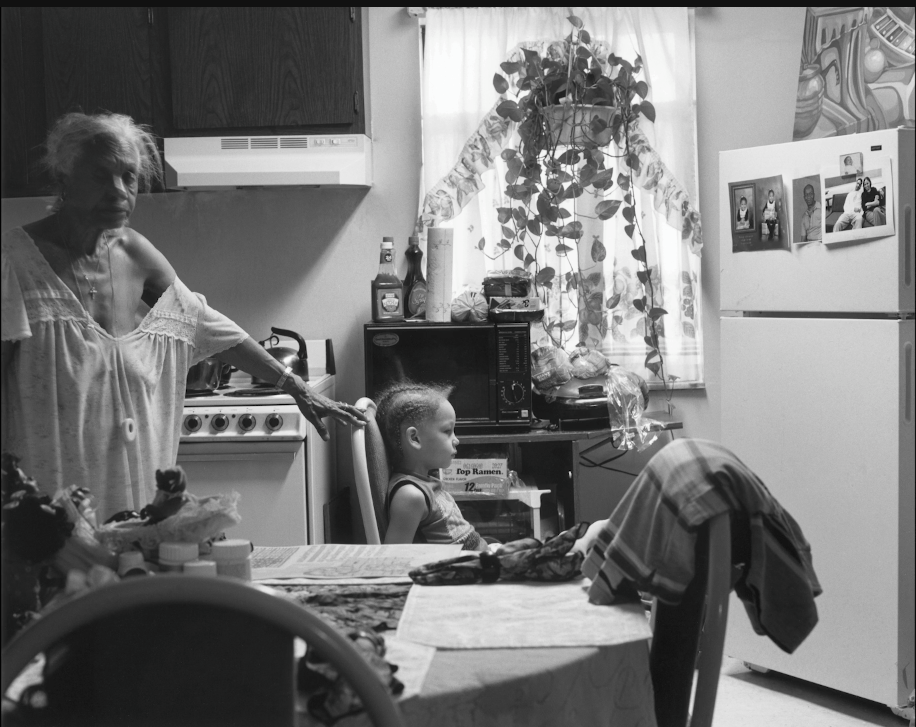
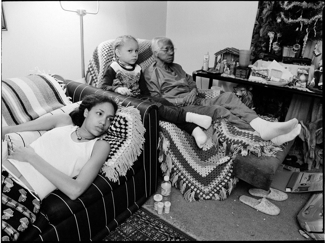
In ‘The Notion of Family’ by LaToya Frazier she captivatingly “set her story of three generations—her Grandma Ruby, her mother, and herself—against larger questions of civic belonging and responsibility. The work documents her own struggles and interactions with family.”
2-0

La-Toya-and-grandmother

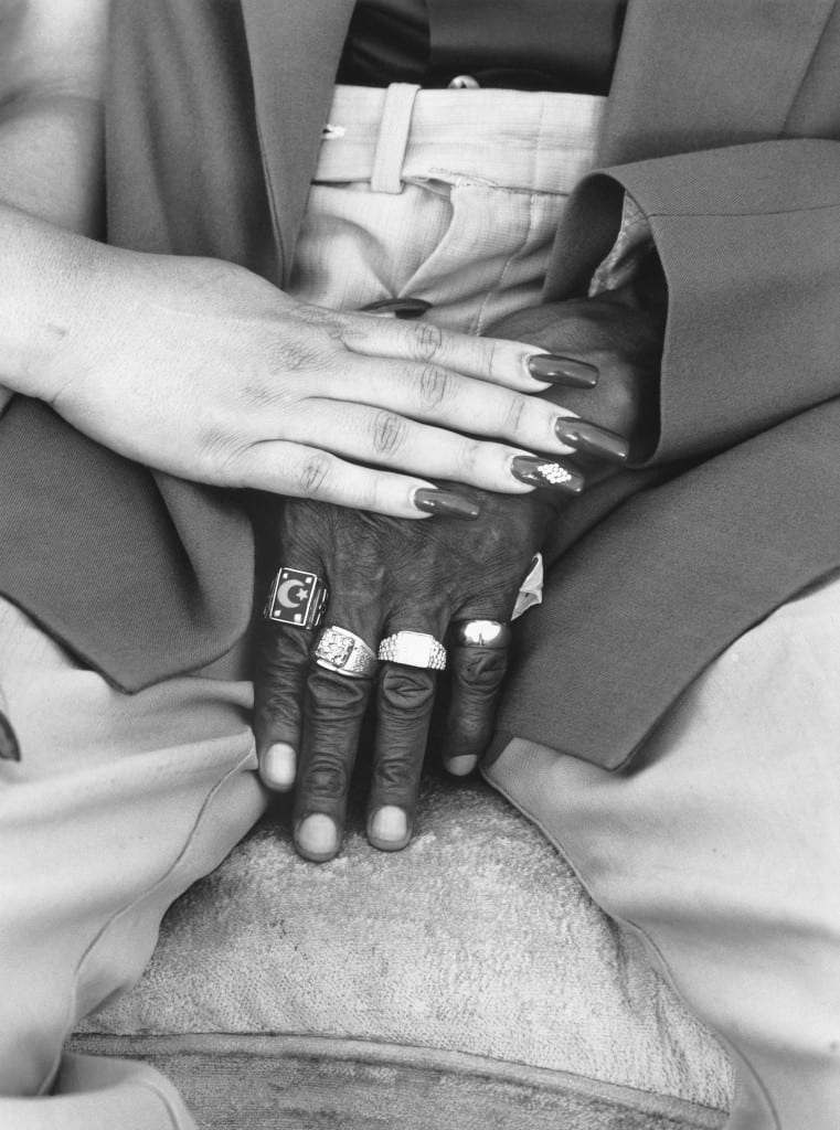
LaToya-Ruby-Frazier-Mom-and-Mr.-Yerbys-Hands-2005-©-LaToya-Ruby-Frazier-from-The-Notion-of-Family-Aperture-2014

LaToya Frazier brings the rawness and honesty with the participation of her family. The presence of ‘the mother’ as a subject in this piece turns this notion of family as genuine as you can get. Taking a documentarian approach to it.
As Frazier says, her mother is “coauthor, artist, photographer, and subject. Our relationship primarily exists through a process of making images together. I see beauty in all her imperfections and abuse.”

Frazier strengthens the idea of rearranging the traditional atmosphere of family and community by transforming a new capsule of image making and setting a dialogue by narrating her own notion of family.

The Amber Online Collection

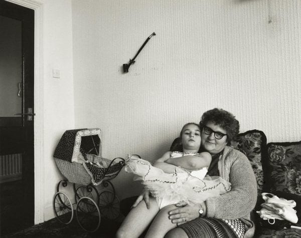
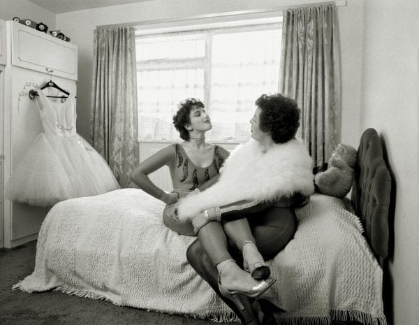
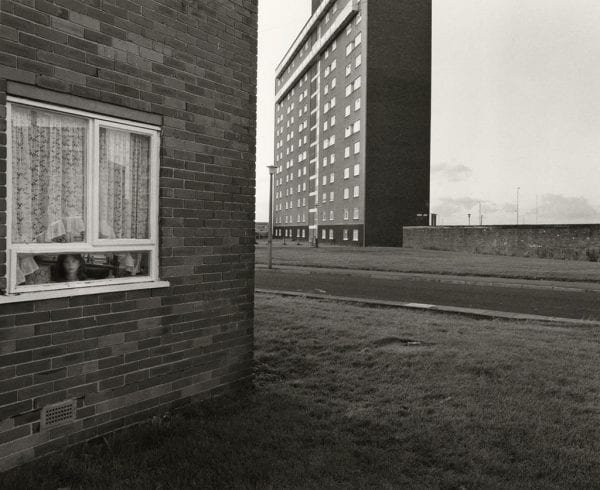
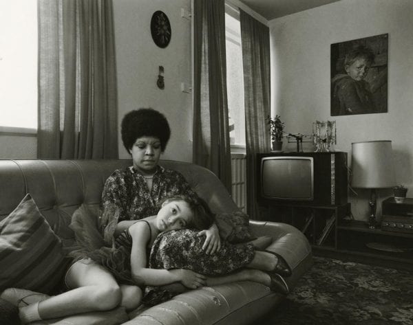
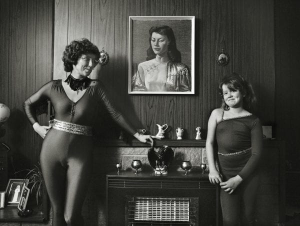
In this work the relationship between mother and daughter are explored, being documented between the early and mid-1980s. The setting environment was a dancing school in North Shields.
059-013-LBW-jpg-9051-600x473

059-016-LBW-jpg-9054-600x452

059-014-LBW-jpg-9052-600x475

059-020-LBW-jpg-9058-600x465

059-026-LBW-jpg-9064-600x490


This series of images show a celebration as a female community comes together. Through these relations between the subjects we get the sense of realism and uncomplicatedness combined with a harmonic romanticism where everything finds its right place.

What really captures the viewer is those relationships that are portrayed. The belonging feeling and the sense of togetherness is mesmerizingly candid and captivating. There is this sense of home and intimacy.

You are here 

To fulfil this brief in its essence is required to find that notion of home and family within ourselves. What does it really mean to us? It is a personal task and because of that subjectivity, the right answer was to follow one’s gut feeling. Each photograph in the series should click within us: that is home, as we know it to be. At least a representative part of it.

1 – Hometown Glory

Hometown

Just like in the last photograph of the ‘Amber Online Collecction’ there is this need to pinpoint the series in terms of location. An outside looking in.

In ‘Hometown Glory’ the aiming was to capture the mood of home inserted in the perspective of a town. The urban aspect of it. The outside where it lives as well.

2 – Front Door
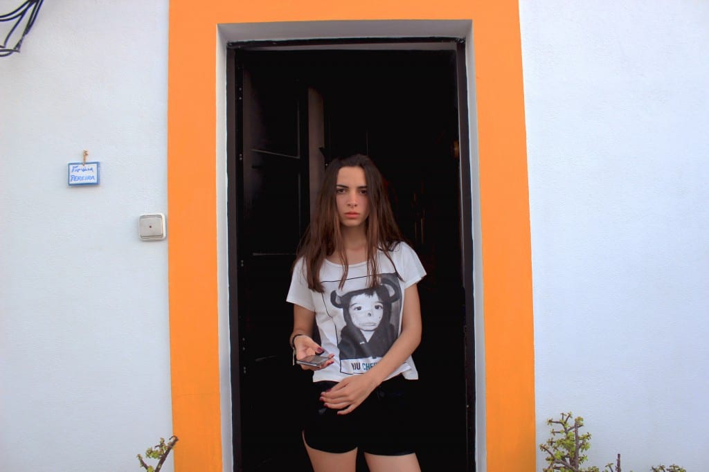
Door

As a way of getting more deep in this understanding of home, the front door represents the invitation to come inside. As an analogy, it is the frame of the whole picture. Signifies the real essence of the feeling of coming home. The door is what lets us break through to the other side. Meeting the front door is our way to get inside.

3 – Mother’s Chest
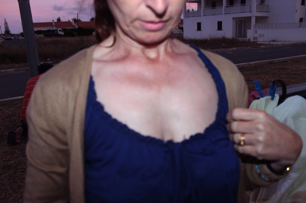
Mom

If home is something that can be found within people, our closest relatives hold a important significance in that sphere. Exploring the notion of family and the relationship between mother and daughter is the one that can drive a very intimate portrait of one’s home. In a different approach of this notion we can go as far as take an isolate part of them. A part that signifies a particular aspect of that close relationship. Their eyes, their cheeks, their arms. Each of these elements have a specific feeling connected to them. In this case, ‘Mother’s Chest’ evokes even more the maternal characteristic related to the mother figure.

4 – Family is Home

Family

To feature a more nuclear centered piece related to the notion of family, the main family unit should be portrayed. Aiming to represent a unity, a closeness that is unspoken but rather felted, almost like the harm feeling of being home and being part of something. Something that it can’t be described but mostly experienced and it comes completely innate. A native conjuring of family. A home within this sentiment is something that cannot be despised when reading the meaning of the word.

5 – A Place of Origin
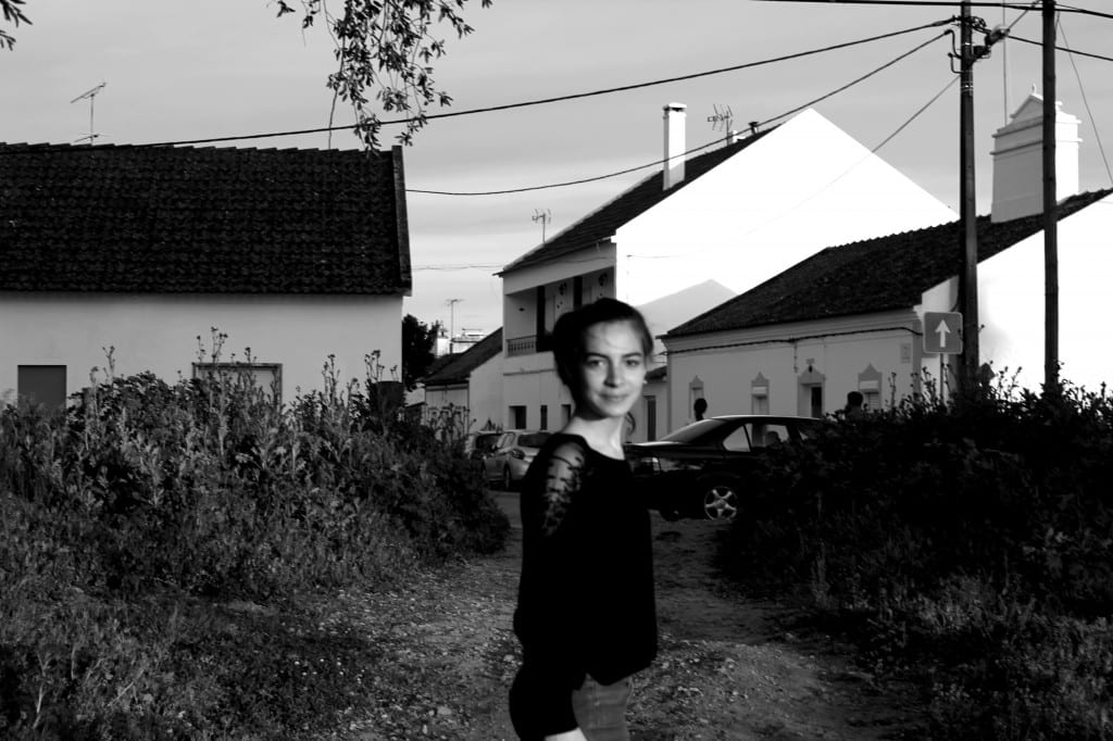
Rua

The three final photographs of this series are set apart. The goal was to go even more into the fundamental. The core of what home is and when did in all started. Going back and remembering the first time we could identify a feeling of home. To accomplish that we go back in time, to our childhood. To represent this idea of the embodiment of the past, the photographs are set in black and white. To also achieve the past as a mood, there is a certain blurriness about the person against a more clear but intriguing background. That can represent in a way this idea of being a ghost. A place that is a part of one’s development but more faded into a memory rather that something belonging to a ‘right now’. Growing up with your grandparents, having the street where you grew up showed, just to realize that it is one of your first known scenario. A very first home. The first place that we belong. A valued place regarded as a refuge or a place of origin.

6 – Two Mothers = Two Homes
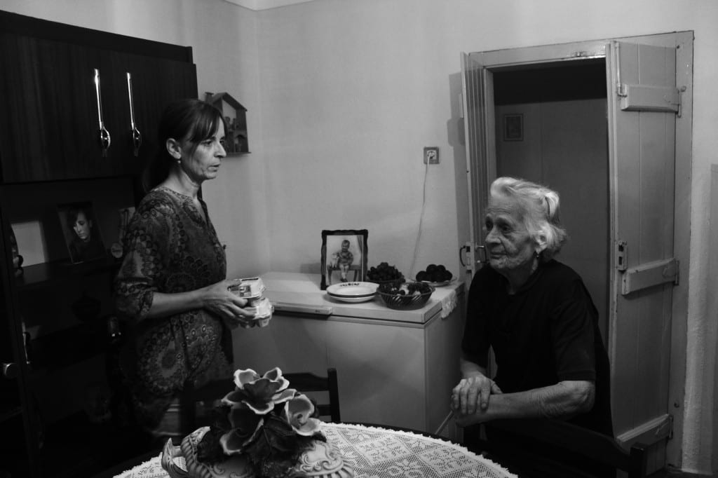
IMG_9223

Still in the ‘past’ we go inside to get closer. There is again the relationship between mother and daughter, but now we set the story of three generations. A story that visually starts with the interaction between subjects and the environment around them, but also what they represent when telling about what ‘home’ is. There is this harmony with the surroundings. It’s intertwined with the subject matter. The environment has some little displays of memories. The old photographs in the image telling again the tale of the past. In a small detail, but an important one, behind the mother there is this old photograph of when she was younger. Not only this image represents home subjectively to the author but also for the subjects in it. Home is those small interactions that signify this mundane that we are used to. Those usual settings. Holding two egg boxes, maybe talking about it. Those little exchanges set the mood of the social unit. Feels accurate, as close as you can get of having a visual document of one’s subjectivity notion of family. Home is exposed here. It relates to two mother figures. It’s home because is the very instinctive. Is what you know it to be.

7 – Grandma’s Hand
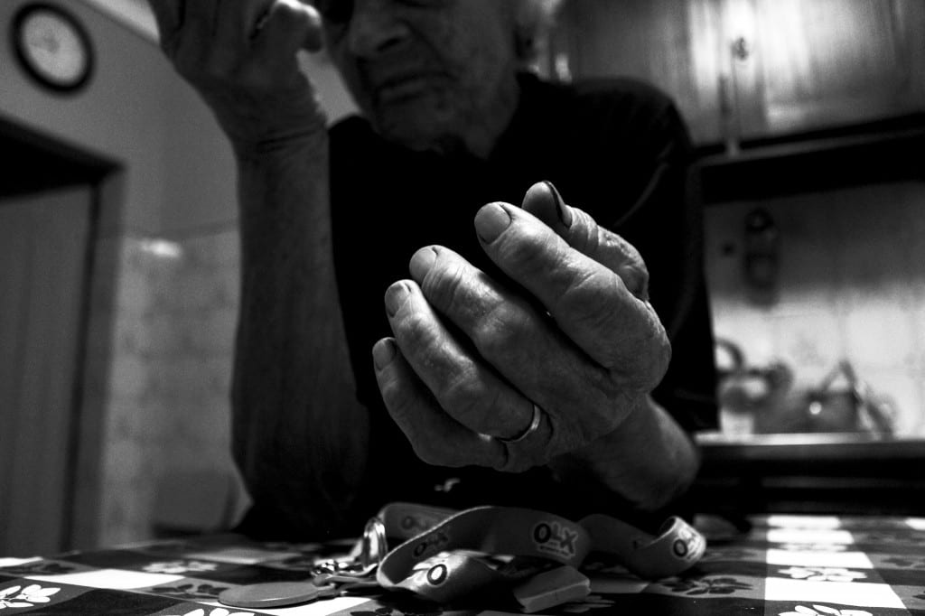
Hands

As a final piece, a detail is depicted. If home is where the heart is, then it can be, symbolically, in your grandma’s hands. Again, having a detail of a feature, gives the subject a specific meaning. Being raised by your grandmother, her hands suggest the ‘feeling of being taking care of’. In a very intuitive and instinctual way, that is what home is. It ends as it arrives to its destination, like a journey that we are taking towards finding the very truth behind what home means.

Brief 1 – Appropriation

The concept for the appropriation brief was to reveal the undercover reality of advertised products, that can be considered as a drug but are not taken as one by society. This products are portrait as harmless but have a detrimental effect when consumed. Being basically used as an everyday stimulant.

To capture this a collage of elements, within the magazine advertisements, that point out the ugly truth of the product.

CocaineAd

The ‘Cocaine-Cola’ has a strong reference to the curious fact that until 1903, the world-famous soft drink contained a significant dose of cocaine. Some research suggests that even up until 1929 there were still traces of cocaine in the drink.

Even without cocaine in it, has in this century, Coca-Cola is still a controversial drink. It’s common knowledge that the drink is detrimental to one’s health. Even though the caffeine in Coca‑Cola products is not addictive, the sugar rush effect experience while drinking it, resembles the outcome of consumption of drugs. Besides that, Coca-Cola is one of the most popular drinks in the world, being worldwide consumed and it is common for even children to drink it.

 

CoffeeAd


The ‘Prescription Coffee’

We live in a cultural where the consumption is downplayed as something casual. Many people have this undercover addiction with coffee. Almost going crazy if they don’t have their cup of coffee in the morning and sometime throughout the day. So, there is this idea that coffee works like a prescription pill, something that you need to have in order to function. But it’s often taken as a harmless drink. Even romanticized.